-Dark.png?width=250&height=127&name=CS-Coaching%20Systems%20Logo-Alt%20Version(1)-Dark.png)
Overview
The Dashboard gives you a top-level summary of what's happening across your organization: how many issues need attention, key volume metrics, and a trend of completions over time — all in one screen, without needing to dig through the Enrollments, Students, or Key grids individually.
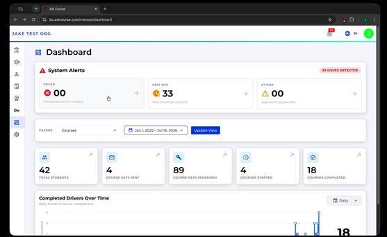
The Dashboard, showing system alerts, summary stats, and the completions chart.
System Alerts
At the top of the Dashboard, the System Alerts panel flags issues that may need your attention, with a total count of issues detected and a breakdown by type:
|
Alert |
What it flags |
|
Failed |
Students who did not pass a course. |
|
Past Due |
Enrollments that have gone past their due date without being completed. |
|
At Risk |
Enrollments that are on track to become past due or otherwise need attention soon. |
Summary statistics
Below the alerts, five stat cards summarize activity across the organization:
|
Stat |
What it counts |
|
Total Students |
The number of students in your organization. |
|
Course Keys Sent |
The number of Authorization Keys that have been emailed to recipients. |
|
Course Keys Redeemed |
The number of Authorization Keys that have been used to unlock a course. |
|
Courses Started |
The number of course enrollments students have begun. |
|
Courses Completed |
The number of course enrollments students have finished. |
Filtering the view
You can narrow what the Dashboard reflects using two filters: a Courses filter to focus on specific courses, and a date range filter to focus on a specific period. Select Update View after changing filters to refresh the stats and chart.
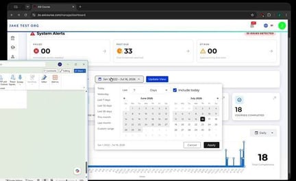
The date range filter, with quick options like Last 7 Days, Last 30 Days, and Custom Range.
Tip: The date range filter includes quick presets (Today, Yesterday, Last 7/30/90 Days, This Month, Last Month) as well as a Custom Range option and an Include Today toggle.
The completions chart
The Completed [Courses] Over Time chart shows completion volume across your selected date range, with a granularity control (for example, Daily) so you can view the trend at different levels of detail.
Drilling into the details
The alert counts and stat cards aren't just numbers — selecting one takes you to the Enrollments Grid, pre-filtered to show exactly the records behind that number (for example, every enrollment completed within the selected date range).
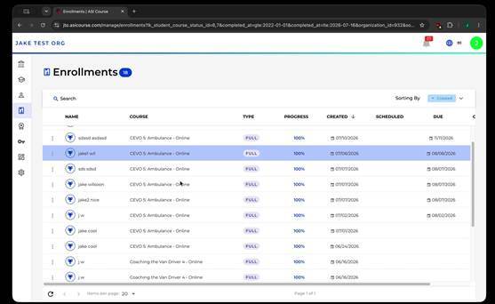
Selecting a Dashboard stat opens the Enrollments Grid, pre-filtered to match it.
Tip: This is a fast way to go from a high-level number on the Dashboard straight to the specific students and enrollments behind it, without having to rebuild the filter yourself.
Quick reference
- System Alerts = Failed, Past Due, and At Risk counts that need attention.
- Five stat cards summarize students, key activity, and course starts/completions.
- Filter by course and date range, then select Update View to refresh.
- The completions chart shows trend over time, with adjustable granularity.
- Selecting any alert or stat card drills into a pre-filtered Enrollments Grid.